Data Visualization Tips and Tricks for Water Quality Monitoring
Data visualization is an important tool for communicating science to a broader audience. Whether you are a volunteer community scientist or a professional aquatic ecologist, there are many free tools and low-cost programs that you can use to link the scientific data to actions that can improve water quality. We will walk you through the process with some tips and tricks on how to communicate your results most effectively.
Step 1: Organize Your Data
The first step is to organize and analyze the data so you can determine the results of your monitoring effort. We recommend using spreadsheet software such as Google Sheets (free) or Microsoft Excel (low cost, available on many public computers). For standardized data entry format, there are three options: long format, wide format, and tables (ex: by station, year, etc.). We recommend using a long format (see the images below). Simply put, long format often contains values that repeat in the first column, while wide format does not contain values that repeat in the first column. Using the long format example below, each row (horizontal) represents data that was collected at the same time and location. With our wide format example, each column (vertical) represents data that was collected at the same time and location. Long format is generally considered the standard data entry format, and some statistical programs require data to be entered in long format. And, don’t wait until the end of the field season to collect your data; consistently upload it as you collect it and make sure to save a backup copy somewhere too!


Step 2: Chart Your Data
It is difficult to identify trends by just looking at the raw data, and frankly it can be overwhelming if you’ve collected a lot of information. This is especially important when working with large datasets. And, when working with data, it is of the utmost importance to objectively display the data (check your axis scales!). Utilizing the built in functionality of the selected spreadsheet program enables quick and easy ways to create charts and graphs. By visualizing data, it’s much easier to compare the data to water quality standards (i.e., dissolved oxygen, temperature) as well as identify outliers or transcription errors. And, if your data is set up in long format, programs like Google Sheets will even recommend helpful charts/graphs once you begin the process. We recommend looking at a variety of charts and graphs to really get a good sense of the information and trends.
Several examples of useful graphs can be found below:


Step 3: Track the Trends
Now that your data is plotted on charts and graphs, take some time to analyze your results. Really sit with the information for some time. Ask yourself, “What stands out?” or “What story is the data telling me?”. If available, share it with a coworker or friend and ask them what they see from the data. Sometimes the data will be consistent and show a steady trend or status. Other times, the data will show odd spikes or inconsistent readings. Either way, the data is the data, and it is up to you to tell the story of this newly analyzed information.
A good example of tracking data and interpreting trends is Lake Hopatcong. Over the last 30 years, Princeton Hydro has collected surface water data. We plotted the average surface temperatures using a line chart. The figure below shows a statistically significant increasing trend in July surface water temperatures in Lake Hopatcong. This data has been linked to climate change impacts and increased harmful algal blooms. While there has been some variability, the trend is rather steady and continues to increase.

Step 4: Determine Your Audience
Before you dive into creating infographics or writing social media posts with your results, determine who your audience is. The general public? Room of policymakers? Top-level scientists? Remember, write for someone, not about something. Whomever is on the receiving end of your information will determine the best methods of communication and how best to present the data. By really understanding your audience, and what they value, you can achieve maximum engagement, and perhaps drive the person to take an action, if that is your goal.
Step 5: Write Your Narrative
Effective science communication is key! Using values-driven and science congruent narratives can help you reach the right people. So where does one start? A narrative is a story people tell about their lives or experiences. Narratives frame the way that people talk about the issues that are important to them, and a means for how people articulate where they fit into complex systems. Effectively engaging with people often requires using narratives to tell people stories that describe reality in a relatable and in a familiar way. Many people have narratives that– for a number of reasons– they are most familiar with, or care most about. Constructing one of these familiar narrative frameworks around an issue will make people more likely to engage with it in a meaningful way.
Use your data to tell the story. Most people aren’t professional scientists and don’t directly experience water quality impairment or ecological disruption in a manner that is readily apparent. As a result, both the public and policymakers tend to experience environmental issues as communicated by the media.
Before you begin constructing a narrative, the first step is to learn to remove your personal bias. Step back, and recognize your biases. You may be passionate about water quality, you may have a strong scientific background, and/or you may be adamant that we need to stop pollution in our waterways. However, not everyone feels the same way or comes from the same background. And that means they might not feel the same way as you about why the action needs to be taken. However it does not mean that you can’t engage using narratives they care about. Here are some narrative types:
- Anthropogenic
- Scientific
- Advocacy
- Ethics
- Sustainability
- Religious
- Environmental
- Social Justice
- Conservative
- Business
- Economic
- Resiliency
Depending on who you are talking to, or where you are presenting your information, you may have to write different narratives. While this takes time and effort, ultimately, it leads to deeper engagement with your audience.
Step 6: Brush Up on Graphic Design Basics
Graphic design by its most basic definition is the art of creating visual content, primarily to communicate messages by applying visual hierarchy and page layout techniques. When developing marketable graphics, ideally it’s best to stick to basic design graphic standards and principles:
- Space: The best designs utilize space in ways that bring attention to the element or result that matters most.
- Balance: Weight (Color, Size, Texture), Symmetry, Asymmetry, Proportions, and Contrast
- Hierarchy: The practice of using elements of your design or layout to direct viewers to where their attention should be focused. Think size, space, texture, typeface weight, color, tint, and direction.
- Lines and Shape : The foundation of design; different shapes convey different messages.
- Typography: All things text! Font and layout can be used to convey a number of different feelings. Bold and all caps can represent important information. For example, lower case italic text can represent scientific information such as latin names for different plant species.
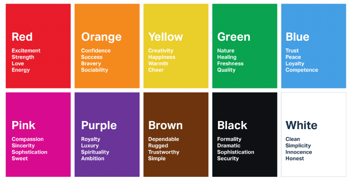
Photo credit: Usertesting.com
- Color: Perhaps the most important element! Color can influence and drive engagement, and repetition of the same color can strengthen brand awareness or a message throughout your document. Psychologists have also developed an extensive list of colors and the related feelings they produce. Check out Canva.com’s interactive tool on color meanings and symbolism.
- Branding: This is your strategy; know your target audience and how best to reach them. Be consistent with your design (logos, colors, style). Good branding can help to generate a loyal fan base.
Step 7: Create Relevant Graphics
Transforming the data into a graph format really allows you to see trends and draw conclusions about what might be happening in your waterway. However, these graphics are not always the ideal graphics to use to communicate to a broader audience. Even if you’re presenting to a room of scientists or mathematicians, presenting the data in a clean, readable way is important to help communicate your results. Now that you’ve identified your trends, determined your audience, and have a good grasp on the stories you want to communicate, it’s time to make your graphics!
If you are not a professional graphic designer, hands down the best program to use is Canva. This is a free, web-based program that is extremely user friendly and provides a plethora of pre-sized graphics and styles for you to customize. It even has infographic templates with the ability to populate basic charts and graphics that look very polished! (Hint: Once you have an account, just search “infographic” and look for the ones with the “free” tag and start designing!)

Step 8: Communicate Your Data
It’s time to tell the world the results! And, honestly, it’s just perfectly fine if the results are not groundbreaking. Consistency and replication in science are very important. If the result is that the water is squeaky clean, then that is just awesome. If the result is that the water is not safe for swimming, well that is important to report and perhaps drive some action. Utilizing digital tools such as blogs, website pages, social media platforms, etc are great ways to get your message out there. Just keep in mind that each platform might have a different audience, and therefore a different narrative! Another good way to communicate information is through a press release or discussion with a local reporter. Getting your data published in the media is a quick way to reach large audiences.
One of our favorite ways to share data is through an ArcGIS StoryMap. We have found the combination of embedded maps, text, and photos is a great way to visual results in a way that is digestible to the public. While this requires someone to have an ArcGIS Online account, nonprofits can get a yearly subscription for just $500/year, which enables them to host a StoryMap. Here’s a cool example of a recent StoryMap that Princeton Hydro designed after one year of water quality and trash monitoring on the Schuylkill River: https://bit.ly/schuylkillriver. (TIP: A graph created in Google Sheets can be directly embedded into a website/blog, including into an ArcGIS StoryMap. Simply publish the chart and copy the embed code into the webpage. This enables the graph to be interactive & clickable compared to the traditional method of uploading a static JPEG into the webpage.)
Science communication is a critical part of being a scientist, whether a volunteer or professional. There are many different ways to do it. So if one way doesn’t work, try something new. We encourage you to keep telling your stories using the principles presented above to communicate the results to whatever audience is important to you!
For more tips and tricks, including a tutorial on how to make graphs using Microsoft Excel, graphic design 101, and a deeper dive on engagement strategies, watch the webinar Princeton Hydro led for River Network.