Mapping Water and Equity Considerations- Federal and State Tools
This blog post was co-authored by Erin Kanzig and Colleen Walters

With the recent launch of the Climate and Economic Justice Screening Tool (CEJST) by the Council on Environmental Quality (CEQ) to identify communities that are disadvantaged and overburdened by pollution, and ongoing efforts at the state-level to identify the location of environmental justice communities, you may be wondering how these types of mapping tools relate to water data and the work you do related to permitting, climate resiliency, or community engagement.
We’ve created a resource page on federal and state water and equity mapping tools, including a table summarizing similarities and differences between them. To introduce you to these tools, this blog breaks down:
- Why mapping tools matter,
- Why indicators for race and class matter,
- Why different water indicators matter (and why they aren’t as prevalent)
- Examples of how to use EJSCREEN, CEJST, and How’s My Waterway?
Why Mapping Tools Matter
Maps can be powerful tools to visualize data in clear and meaningful ways to inform the state of your watershed. This data visualization can be integral to telling the story of your watershed, highlighting issues, and empowering local action to advocate for change. Maps can be used for many purposes and audiences, allowing not only those working in the water space, but also the general public to digest complicated data and understand how it may impact their community. Mapping tools can be a resource for strategic planning efforts, watershed or regional restoration programming, place-based initiatives, public education and outreach, advocacy, and more.
Mapping tools, like those focused on water quality and environmental justice mentioned below, allow for consumption and comparison of information across multiple data sets, parameters, and layers, all while displaying data geographically. These overlays can expand the story of pollution to not just what is impacted, but also who is experiencing these impacts. Organizations can put this information into action by creating and sharing these data visuals with the public and decision-makers, highlighting environmental injustice through data, and seeking solutions to address areas most impacted.
Why Indicators for Race and Class Matter
Environmental justice (EJ) is defined by the EPA as “the fair treatment and meaningful involvement of all people regardless of race, color, national origin, or income, with respect to the development, implementation, and enforcement of environmental laws, regulations, and policies.” When it comes to who experiences the worst cumulative impacts of environmental pollution, race is the leading indicator (for example, see research from CA and WA). Communities of color are more likely to face negative environmental impacts, even across class. Therefore, if we want to truly identify environmental justice communities, it’s important to include data on race and ethnicity. Class is another key indicator and illuminating “disadvantaged communities” requires not just looking at income, but other indicators that point towards historical marginalization and underinvestment across a swath of infrastructure and essential services projects.
Strikingly, the CEJST does not include race as an indicator, presumably to avoid litigious and judiciary concerns – yet EJScreen, How’s My Waterway, and all state-level environmental justice mapping tools include race.
Why Different Water Indicators Matter (and why they aren’t always as prevalent)
Historically, a majority of environmental justice concerns centered around air quality violations, and EJ mapping tools reflect that in the indicators they include. For example, the CEJST indicators include particulate matter in the air, diesel particulate matter exposure, traffic proximity and volume, and asthma rates, while wastewater discharge is the only directly-water related indicator for both CEJST and EJScreen (proximity to hazardous waste facilities, National Priorities List sites, and Risk Management Plan facilities may negatively affect air, land, and water, and are included in CEJST and EJScreen). EJScreen includes additional metrics on air pollution, including ozone, air toxics cancer risk, and an air toxics respiratory hazard index.
In comparison, the federal How’s My Waterway tool from US EPA aims to provide data about local waterway conditions. While not explicitly designed to address equity and justice concerns- when layered with demographic indicators it can serve as a powerful tool to show patterns of environmental injustice related to water quality and compliance with state and federal regulations. Water indicators in the How’s My Waterway mapping tool includes information on water quality assessments, impaired waters, and total maximum daily loads, facility environmental regulation enforcement and compliance history, and information on public water systems’ monitoring, enforcement, and violation data (see a full list here).
At the state level, environmental justice mapping tools vary on what kinds of environmental indicators are included related to water. Some, like Washington, only include data on wastewater discharge. California includes data on some drinking water contaminants (Including lead, arsenic, and nitrate), groundwater threats, and impaired water bodies. New Jersey’s Environmental Public Health Assessment data includes levels of arsenic and nitrate in community drinking water systems and private wells, and disinfection by-products in community drinking water systems.
When using data from mapping tools to identify environmental justice communities/disadvantaged communities (DAC), it’s important to start with how those communities are defined, and to consider cumulative impacts when considering decisions that could impact EJ communities/DAC. For example, CalEnviroScreen includes the ability to rank all census tracts using a score based on pollution burden (average exposure and environmental effects) and population characteristics (average of sensitive populations and socioeconomic factors).
Examples of how to use EJScreen, CEJST, and How’s My Waterway
| EJScreen | CEJST |
How’s My Waterway |
| American Rivers developed a Water Justice Toolkit that includes recommendations for using data sources such as EJScreen in community science projects.
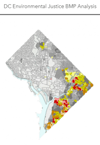
In Washington, DC, the Department of Energy and Environment use this tool to inform equitable implementation of stormwater best management practices. |
This tool was designed for federal agencies to implement their Justice40 plans, but you could use this data to advocate for water infrastructure investment at the state-level, especially as states consider updating their definitions of “disadvantaged community” related to State Revolving Funds. | This tool is unique in terms of its scale- it includes data from community, state, and federal datasets. It’s a user-friendly tool that provides plenty of background information and is designed for the general public to learn about the condition of their waterways and water quality information. |
Opportunities to learn about and supply feedback on tools
Climate and Economic Justice Screening Tool – CEQ seeks public input on the current version of the Climate and Economic Justice Screening Tool. They convened several training and listening sessions and may do so again, but for now feedback may be sent to Screeningtool-Support@omb.eop.gov or through the CEJST Survey. Formal comments are open through May 25 through the federal register.
EJScreen – EPA holds office hours for users of EJScreen 2.0 on a bimonthly basis. Recordings of previous sessions are available.
State Tools
Currently, some states are in the planning phases of developing environmental justice mapping tools. Michigan’s MiEJScreen is open for comments through May 16.
Oregon passed House Bill 4077 last year, which directed the state to develop an EJ mapping tool and appropriated funds for its creation. The law goes into effect in June 2022 and opportunities for public feedback will likely occur later in the year.
Want to learn more?
Join us at River Rally in Washington, DC Jun 4-7! Several workshops will dive into some of these tools:
Sunday, June 5 at 9:30
EPA Data & Tools for Characterizing Your Watershed
- Let’s apply EPA’s EJSCREEN environmental justice screening tool and the tools How’s My Waterway, the Water Quality Exchange, and ATTAINS. We will run reports, look at data, and find environmental and demographic information to characterize your watershed and expand community engagement. Adrienne Donaghue and Kim Balassiano, US Environmental Protection Agency
Tuesday, June 7 at 9:30
DC’s Stormwater BMP Equity Analysis
- DC’s Department of Energy and Environment will share preliminary analyses of Best Management Practices (BMP) distribution throughout the city through the lens of EPA’s Environmental Justice Screening Tool. Results will inform future efforts to focus BMP implementation in more equitable ways to serve all District residents. Lorena Kowalewski, DC Department of Energy & Environment


